There's an old adage in show business that goes, "never work with animals or children." The same could be said for photography. Sure, there are a lot of photographers that make wonderful careers out of taking pictures of wildlife, but animals pose a number of challenges that we have to overcome if we want to take a decent shot. I, for one, have a lot of respect for the National Geographic photogs who schlep a thousand pounds of extremely expensive equipment into a hostile environment, and still manage to capture some candid photos of wild animals doing whatever it is they do.
So today, in honor of International Animal Photography Day, a holiday I made up for this blog post, I present some of my attempts at animal photography. First up, a squirrel.
At least, I think it's a squirrel. I didn't have the camera anywhere near set up for the lighting conditions, so the shutter speed was all wrong, and the camera moved while the shutter was open. Next attempt, a crow.
This one, I spotted a murder (a group of crows) on the side of the road and pulled over. Not wanting to scare the crows, I rolled down the passenger window and attempted to shoot out the open window while leaning across the center console of my truck. It didn't work. The camera wasn't really set up for it.
Well after that I decided that I really wanted to get a shot of a wild animal. Any wild animal. In this case it ended up being a flying rat. (Seagull)
As you can see I used the "snap as many as possible and hope one turns out" technique. It's surprisingly effective, and something I would have never tried when I shot film. Just so you and I are on the same page here, that set of photos is a sampling of the pictures of that gull. There are more. I only ended up putting one into my portfolio. For reference, here's the final pick, edited:
So that's it. I'm pretty much stuck with that technique. I'm a lumbering oaf, so sneaking up on a critter isn't exactly easy for me. I'm also not made of money, so a $14k super-telephoto is completely out of my price range.
To try to put a bow on this one, I'll say this: Get out there and keep shooting. Take lots of pictures. One of them will be what you are looking for.
Monday, December 11, 2017
Friday, December 8, 2017
Composition Week: Negative Space
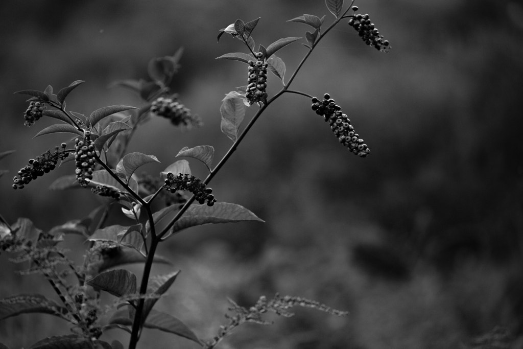
For the final day of composition week, we're going to look at the opposite of yesterday's technique. Today it's the use of negative space. Negative space is the area around the subject of your piece. Unlike in graphic design, our negative space isn't necessarily empty. Let's look at a couple examples:
In these two examples, the negative space is the out of focus area all around the plant that's the subject of the image.The area that's out of focus helps highlight the shape and texture of the plant. We're also helped by the back lighting that serves to create an outline around the thistle, and helps the berries pop out from the background.
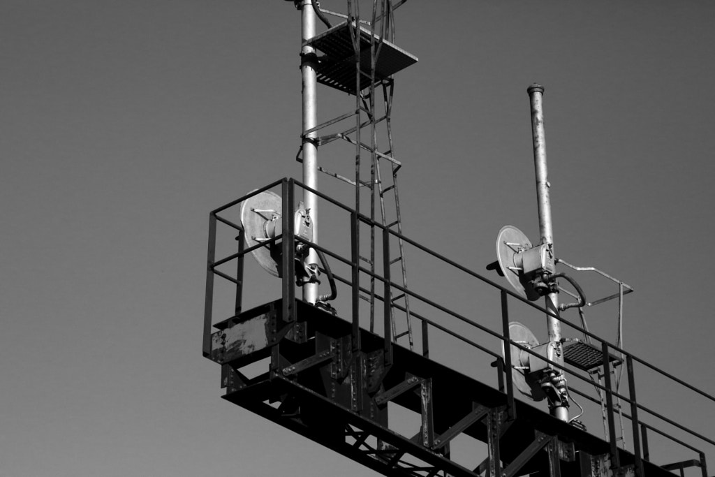
In the next example, an empty sky serves as the negative space.
The blank sky doesn't distract from the small details, and indeed helps them stand out. With a busy background, the thin lines of the hand rails and ladders would be completely lost. This example also shows that there doesn't need to be something in every corner of your frame. In fact, the left-most third of this image is entirely blank, save for the slight gradient from the sky.
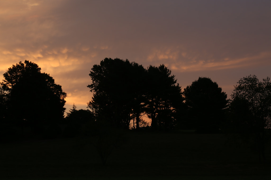
One last image to demonstrate negative space. In this case a silhouetted hill at sunrise.
The black band at the bottom of the image helps to highlight and counterbalance the sky. It pushes the eye up towards the top of the image, towards the texture of the leaves on the trees, and the colors of the clouds.
When considering composition, remember that the rules are just guidelines. They can help you get started composing images, but, in the end, they are just tools for you to use. When you break one of the rules of composition, try to consider how breaking that rule helps your image. (Whatever media you're working in, be it painting, drawing, or photography)
Well that'll do it for composition week. If you liked it, let me know. I've got about 30 more composition techniques in my topic list, and I'd be happy to do this again*. I do reserve the right to revisit any of these in the future, partially because I'm half senile and can't remember what I did yesterday, but also because there's almost always more you can say about the topic. We'll see you next week for the return of Mediocre Monday.
* I'll gladly do this again, but it's a lot of work, so it will be a little while before I'm up to doing it.
In these two examples, the negative space is the out of focus area all around the plant that's the subject of the image.The area that's out of focus helps highlight the shape and texture of the plant. We're also helped by the back lighting that serves to create an outline around the thistle, and helps the berries pop out from the background.
In the next example, an empty sky serves as the negative space.
The blank sky doesn't distract from the small details, and indeed helps them stand out. With a busy background, the thin lines of the hand rails and ladders would be completely lost. This example also shows that there doesn't need to be something in every corner of your frame. In fact, the left-most third of this image is entirely blank, save for the slight gradient from the sky.
One last image to demonstrate negative space. In this case a silhouetted hill at sunrise.
The black band at the bottom of the image helps to highlight and counterbalance the sky. It pushes the eye up towards the top of the image, towards the texture of the leaves on the trees, and the colors of the clouds.
When considering composition, remember that the rules are just guidelines. They can help you get started composing images, but, in the end, they are just tools for you to use. When you break one of the rules of composition, try to consider how breaking that rule helps your image. (Whatever media you're working in, be it painting, drawing, or photography)
Well that'll do it for composition week. If you liked it, let me know. I've got about 30 more composition techniques in my topic list, and I'd be happy to do this again*. I do reserve the right to revisit any of these in the future, partially because I'm half senile and can't remember what I did yesterday, but also because there's almost always more you can say about the topic. We'll see you next week for the return of Mediocre Monday.
* I'll gladly do this again, but it's a lot of work, so it will be a little while before I'm up to doing it.
Thursday, December 7, 2017
Composition Week: Fill the Frame
Today, it's a technique near and dear to my heart. We're going to call it "Fill the Frame" for lack of a better name, but basically the idea is to fill the frame with your subject. Let's look at some examples of the technique.
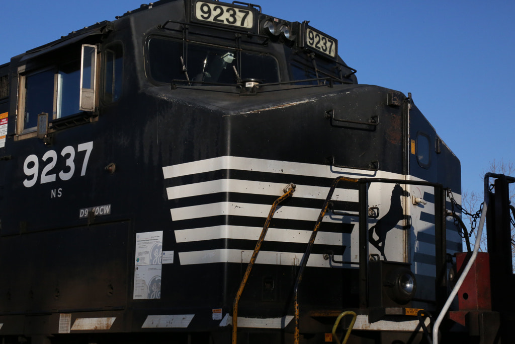
In these two examples the subject completely fills most of the frame. This helps us in a couple of ways. First, it makes these locomotives look larger than life. They are big and imposing, and filling the frame with them makes that apparent. Second, it allows the details to stand out from the object. We are far enough back that the subject is identifiable, but we're close enough that the small details really start to pop out. Third, because of the way that they're framed, we're seeing the subject in a way that we don't ordinarily get to see. It forces us to think about the scale of the object in a different way.
In our next example we take a slightly different tack, rather than overfilling the frame to make our subject seem larger, we use the filled frame to force our viewer to look at the textures and details.
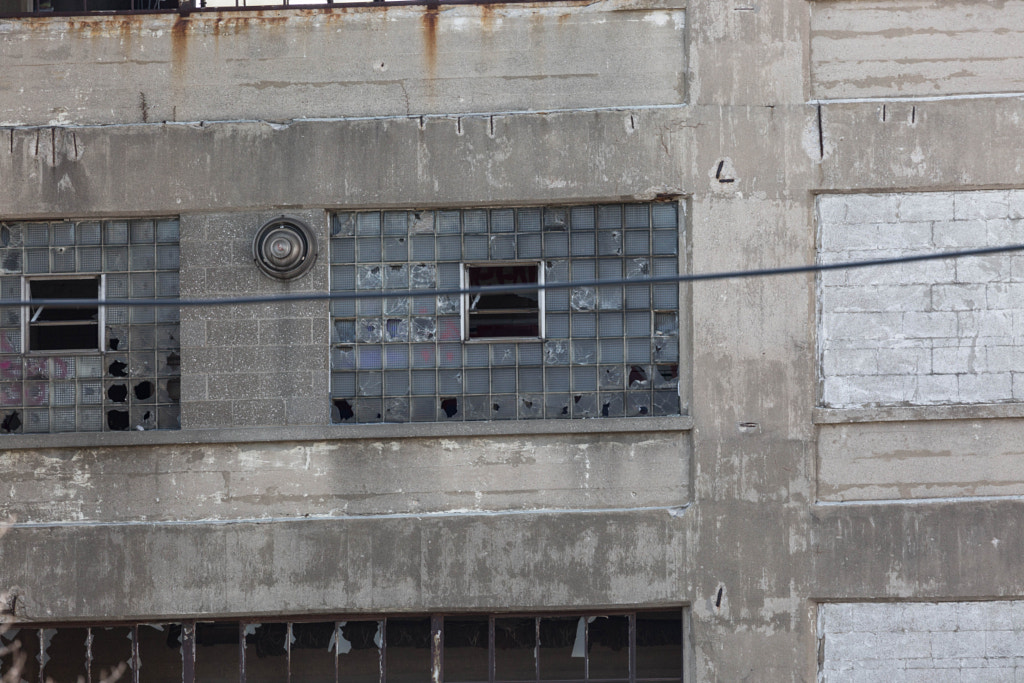
The abandoned cement plant in this image isn't framed in a way to make it imposing, it's framed to show the different textures. By framing this way, we can see the different textures-- from the rust at the top left, to the broken windows at the bottom left, over to the cinder blocks on the right. The relatively uniform background color helps to unify all the different textures. If it was framed to show the entire building, then the texture and color would be lost. (The viewer sees the picture, their says 'abandoned building' and then doesn't see the interesting shapes and textures.)
Tomorrow, for the last day of composition week, we're going to look at the opposite technique to the fill the frame technique. I hope you'll stick around.
In these two examples the subject completely fills most of the frame. This helps us in a couple of ways. First, it makes these locomotives look larger than life. They are big and imposing, and filling the frame with them makes that apparent. Second, it allows the details to stand out from the object. We are far enough back that the subject is identifiable, but we're close enough that the small details really start to pop out. Third, because of the way that they're framed, we're seeing the subject in a way that we don't ordinarily get to see. It forces us to think about the scale of the object in a different way.
In our next example we take a slightly different tack, rather than overfilling the frame to make our subject seem larger, we use the filled frame to force our viewer to look at the textures and details.
The abandoned cement plant in this image isn't framed in a way to make it imposing, it's framed to show the different textures. By framing this way, we can see the different textures-- from the rust at the top left, to the broken windows at the bottom left, over to the cinder blocks on the right. The relatively uniform background color helps to unify all the different textures. If it was framed to show the entire building, then the texture and color would be lost. (The viewer sees the picture, their says 'abandoned building' and then doesn't see the interesting shapes and textures.)
Tomorrow, for the last day of composition week, we're going to look at the opposite technique to the fill the frame technique. I hope you'll stick around.
Wednesday, December 6, 2017
Composition Week: Lead Lines
For Wednesday of composition week, I want to take a few minutes to look at lead lines. What are lead lines? Well they’re lines that help someone looking at our image comprehend it, and see the things we want them to see. Let’s look at an example.
Here our lead lines are played by the rails. They guide the viewer’s eye from the left corner of the image up to the primary subject -- the locomotive. The lines don’t necessarily have to be distinct from the subject of the image. In fact, sometimes they can be the subject, as with the following picture.
The only hard rule is that you don’t want your lines to be confusing to the brain. For example, in the optical illusion below, the horizontal lines are all parallel, but the way that the white and black squares are placed causes our brains to see the lines slanted. This dissonance can be a useful thing in art, but generally we want to avoid it in photography to make it easier for our viewer to comprehend our image. Things that confuse the eye can cause motion sickness in some people.
Like all of our previous entries, lead lines aren't necessarily something that you have to use in your images, but they can be helpful tools to keep in your bag of tricks. For the last two days of composition week we're going to look at two more equal-but-opposite techniques. Hope to see you then.
Here our lead lines are played by the rails. They guide the viewer’s eye from the left corner of the image up to the primary subject -- the locomotive. The lines don’t necessarily have to be distinct from the subject of the image. In fact, sometimes they can be the subject, as with the following picture.
The only hard rule is that you don’t want your lines to be confusing to the brain. For example, in the optical illusion below, the horizontal lines are all parallel, but the way that the white and black squares are placed causes our brains to see the lines slanted. This dissonance can be a useful thing in art, but generally we want to avoid it in photography to make it easier for our viewer to comprehend our image. Things that confuse the eye can cause motion sickness in some people.
![]() |
| Cafe Wall Illusion by Fibonacci (CC-SA 3.0/GFDL). From Wikimedia Commons |
Like all of our previous entries, lead lines aren't necessarily something that you have to use in your images, but they can be helpful tools to keep in your bag of tricks. For the last two days of composition week we're going to look at two more equal-but-opposite techniques. Hope to see you then.
Tuesday, December 5, 2017
Composition Week: Centering
Welcome back to the second day of composition week. Today we’re going to talk about centering.
“But wait,” I hear the more attentive among you shout, “yesterday you told us about the rule of thirds, and how we should avoid centering our subject in the image.”
Well yes, and no. Sometimes centering can work to our advantage. At the end of last month I shared this photo:
You can see that I centered the subject of my image. Here’s another example, before I spend a few paragraphs explaining myself:
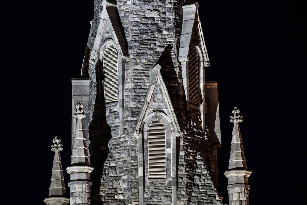
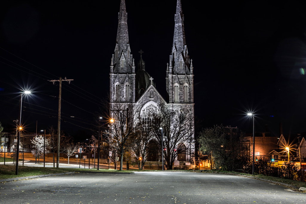
In both of these images I centered the subject because it helps to accentuate the architectural detail. There’s a couple other things that help us here.
First the size of the subject relative to the frame. It’s large enough that it fills about a third of the frame. It’s big enough in the image that we don’t need to put it off center to draw the eye out to the edges of our picture.
Second, there’s enough visual complexity that the subject can stand on it’s own. There are enough details across the object that you necessarily have to look in different places in the frame to see everything.
Third, and finally for today, there’s the symmetry of the subject. We’ll discuss symmetry in another post, but for now, it’s enough to say that the image could feel unbalanced if we didn’t use the center of the photo as the center of the symmetry.
“But wait,” I hear the more attentive among you shout, “yesterday you told us about the rule of thirds, and how we should avoid centering our subject in the image.”
Well yes, and no. Sometimes centering can work to our advantage. At the end of last month I shared this photo:
You can see that I centered the subject of my image. Here’s another example, before I spend a few paragraphs explaining myself:
In both of these images I centered the subject because it helps to accentuate the architectural detail. There’s a couple other things that help us here.
First the size of the subject relative to the frame. It’s large enough that it fills about a third of the frame. It’s big enough in the image that we don’t need to put it off center to draw the eye out to the edges of our picture.
Second, there’s enough visual complexity that the subject can stand on it’s own. There are enough details across the object that you necessarily have to look in different places in the frame to see everything.
Third, and finally for today, there’s the symmetry of the subject. We’ll discuss symmetry in another post, but for now, it’s enough to say that the image could feel unbalanced if we didn’t use the center of the photo as the center of the symmetry.
Monday, December 4, 2017
Composition Week: The Rule of Thirds
Welcome to a feature I'm calling Composition Week! This week we'll be looking at different composition techniques. But first, a disclaimer.
We're going to be talking about composition techniques. This doesn't mean that when taking a picture you need to focus on the composition techniques you want to use. Rather, consider these tools on your utility belt. That is, things you can use when you want to improve your photographs. With practice, you'll train your eye to see things in terms of composition, and you won't need to think about the 'rules'. Also, this is art, so don't get too bogged down with trying to use as many of these rules as possible. That said, let's get going.
We’ll start off composition week with one of the more basic rules. This is something that many of you have probably heard about, called the rule of thirds. Basically, the idea is to put the subject of your photograph slightly off center on a line that’s either ⅓ or ⅔ of the way from the edge or top (or both). In the image below, I drew on the ⅓ and ⅔ lines. (The idea is to put the subject on one of the lines or where the lines cross.)
In this picture the park bench is the ‘interesting’ feature. By putting our subject slightly off center, we help lead the viewer’s eye out of the center of our picture, and create visual interest. The rule of thirds also helps us to break up symmetry in our images, which can make for a more natural feeling.
For comparison, here's the same subject (the bench) placed in the center of the frame.
As you can see, the image feels different. The green leaves to the right side of the image make the image feel unbalanced, and the interesting pink leaves on the right fade into the back as a result of this unbalance.
We're going to be talking about composition techniques. This doesn't mean that when taking a picture you need to focus on the composition techniques you want to use. Rather, consider these tools on your utility belt. That is, things you can use when you want to improve your photographs. With practice, you'll train your eye to see things in terms of composition, and you won't need to think about the 'rules'. Also, this is art, so don't get too bogged down with trying to use as many of these rules as possible. That said, let's get going.
We’ll start off composition week with one of the more basic rules. This is something that many of you have probably heard about, called the rule of thirds. Basically, the idea is to put the subject of your photograph slightly off center on a line that’s either ⅓ or ⅔ of the way from the edge or top (or both). In the image below, I drew on the ⅓ and ⅔ lines. (The idea is to put the subject on one of the lines or where the lines cross.)
In this picture the park bench is the ‘interesting’ feature. By putting our subject slightly off center, we help lead the viewer’s eye out of the center of our picture, and create visual interest. The rule of thirds also helps us to break up symmetry in our images, which can make for a more natural feeling.
For comparison, here's the same subject (the bench) placed in the center of the frame.
As you can see, the image feels different. The green leaves to the right side of the image make the image feel unbalanced, and the interesting pink leaves on the right fade into the back as a result of this unbalance.
Friday, December 1, 2017
Aperture Labs
Today we're going to look at the aperture as it relates to the amount of brightness in our final image. There are other impacts of the aperture like depth of field, but that's a topic for another day. First let's look at what an aperture looks like:
The aperture is the metal blades in the lens. For this article we're going to consider that the aperture limits the amount of light that passes through the lens. (It does other things that we'll address in future entries.) We refer to the size of the circle in terms of f/ number which is the ratio of the lens focal length to the size of the hole. A larger number is a smaller hole, which lets through less light. For a practical example, I made another animation.
As you can see, the smaller the number in the bottom right corner gets, the brighter our image. You can also use this information for selecting a lens for shooting at night. A lens with a smaller f/ number will let you shoot in darker conditions. As an example, if I take a f/5.6 lens* it will be harder to get bright exposures than with a f/1.8 lens.
* Lenses have two numbers when you're looking at them, one is the focal length and the other is the f/ number. That f/ number is the number of the lens when the aperture is fully open, or the maximum aperture / minimum f/ number. At some point in the future I'll write an entry about how the f/ number is derived.
![]() |
| Photo from Wikimedia Commons by User Mohylek. Creative Commons Attribution-Share Alike 3.0 Unported License |

As you can see, the smaller the number in the bottom right corner gets, the brighter our image. You can also use this information for selecting a lens for shooting at night. A lens with a smaller f/ number will let you shoot in darker conditions. As an example, if I take a f/5.6 lens* it will be harder to get bright exposures than with a f/1.8 lens.
* Lenses have two numbers when you're looking at them, one is the focal length and the other is the f/ number. That f/ number is the number of the lens when the aperture is fully open, or the maximum aperture / minimum f/ number. At some point in the future I'll write an entry about how the f/ number is derived.
Subscribe to:
Posts (Atom)
Programmer vs Software Engineer: The Interview
A common question presented in interviews for developer positions goes something like this: Given an array of numbers, write a function th...
-
A common question presented in interviews for developer positions goes something like this: Given an array of numbers, write a function th...