Today, it's the 1920's era Shrine of St. Catherine for Mothers Catholic Church, in Waterbury, CT. The architecture is French Gothic style. (Like Notre Dame Cathedral in Paris.)
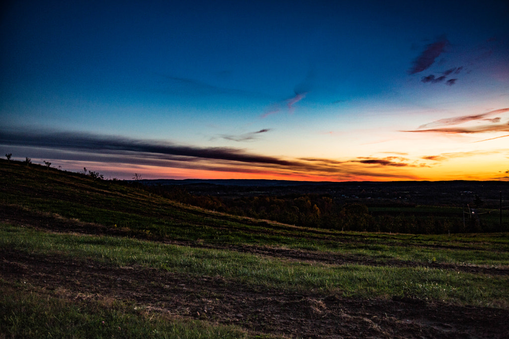
The stark contrast is thanks mostly to the long exposure and relatively slow f-stop. (400mm, ƒ/13, 25s, ISO 100)
Wednesday, November 29, 2017

Monday, November 27, 2017
Mediocre Monday: Covering Sins
Photoshop can cover a multitude of sins. Sometimes you're taking a picture of something, and it's impossible to get the entire image exposed the way you want it. We can do some tricks with techniques like HDR, but that's a topic for another day. Today it's a sunrise.

The hill is too dark, and there's no definition in the sky. Certainly, it's not as embarrassingly awful as some of my other Mediocre Monday entries, but it's not as good as it could be. For reference, here's the picture after post-processing:

The hill is too dark, and there's no definition in the sky. Certainly, it's not as embarrassingly awful as some of my other Mediocre Monday entries, but it's not as good as it could be. For reference, here's the picture after post-processing:
Friday, November 24, 2017
A Frame Within a Frame
Today we're going to look at composition.
Before I start, a disclaimer. There are no hard and fast rules of composition. There are a lot of things we call 'rules' that aren't really 'rules'. They really are more suggestions. That said, understanding various composition techniques can help you take better pictures.
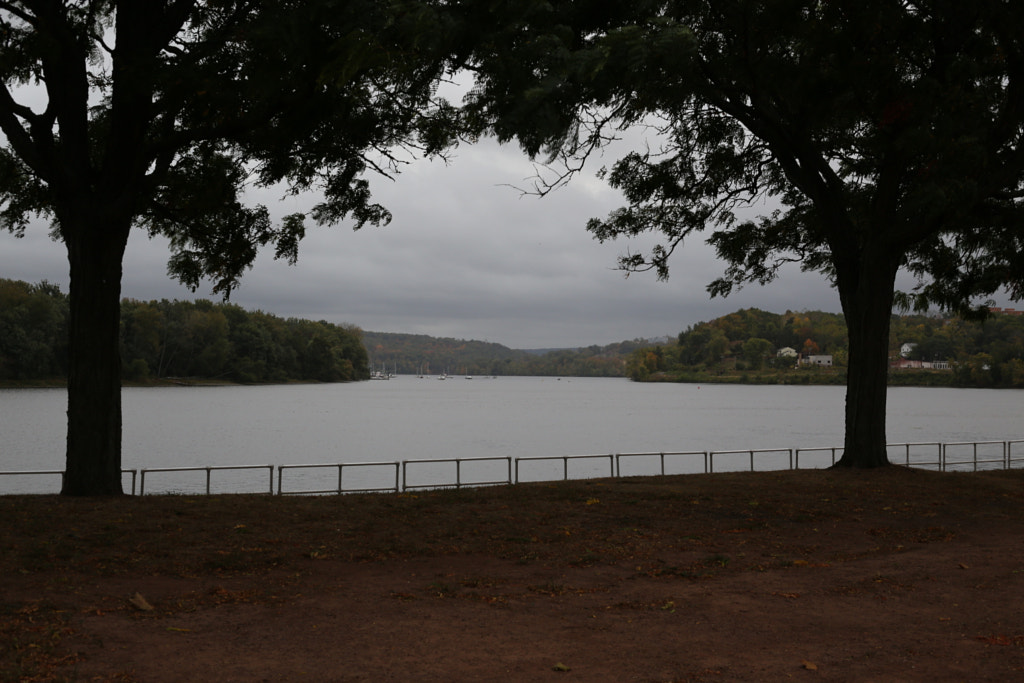
The first technique we're going to look at is framing. In this case it doesn't mean the framing of the image as a whole. Instead we compose the image so that some object in the image frames another subject in the picture. Let's look at an example:
In this first image I used the bridge to frame the buildings in the background. Not only does this introduce some visual interest, but it helps lead the eye through image. By leading the eye, we can help our viewer see what we want them to see.
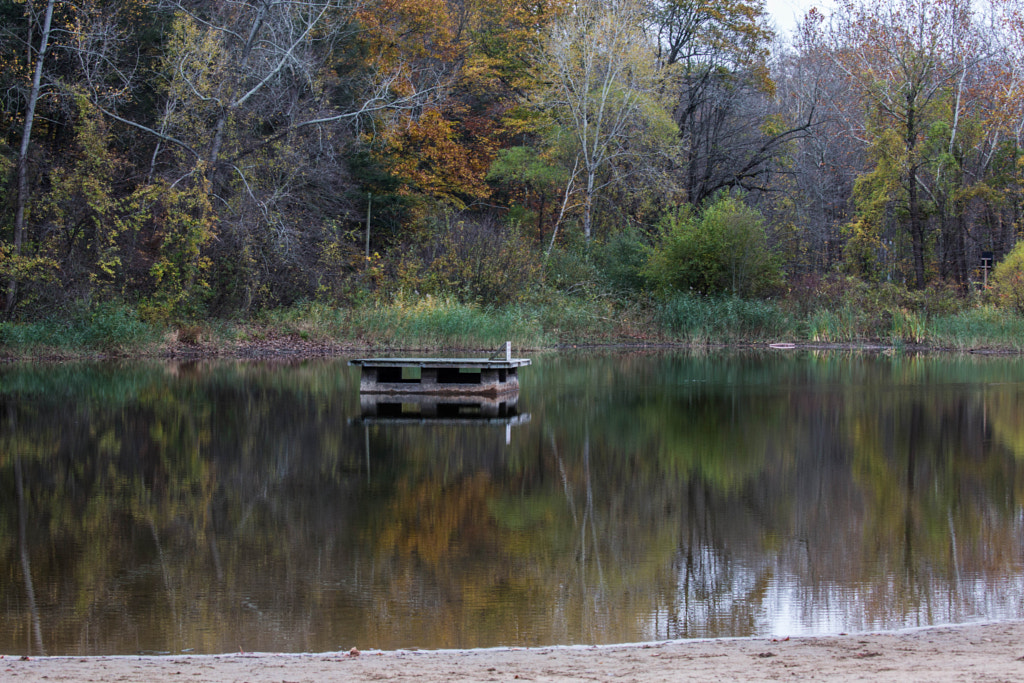
Here's another example:
In this image we're using the trees to frame the view of the river. It naturally highlights the "interesting" part of the picture.
Framing can be used in other ways, but for the sake of keeping these posts short, I'll save it for another time.
Before I start, a disclaimer. There are no hard and fast rules of composition. There are a lot of things we call 'rules' that aren't really 'rules'. They really are more suggestions. That said, understanding various composition techniques can help you take better pictures.
The first technique we're going to look at is framing. In this case it doesn't mean the framing of the image as a whole. Instead we compose the image so that some object in the image frames another subject in the picture. Let's look at an example:

In this first image I used the bridge to frame the buildings in the background. Not only does this introduce some visual interest, but it helps lead the eye through image. By leading the eye, we can help our viewer see what we want them to see.
Here's another example:
In this image we're using the trees to frame the view of the river. It naturally highlights the "interesting" part of the picture.
Framing can be used in other ways, but for the sake of keeping these posts short, I'll save it for another time.
Thursday, November 23, 2017
Giving Thanks
Given that today is Thanksgiving, I thought I'd take a minute away from the blog posts on auto pilot to say a couple quick thank yous.

Thank you, first and foremost to you, my readers. Without you I wouldn't be continuing this blogging adventure.
Second, thank you to my friends IRL and on Twitter for being supportive. I really cannot express how much it helps to make it through the waves of crippling self-doubt.
Last, but certainly not least, I'm thankful for my family, without whom I wouldn't be able to do anything.
Thank you all for reading at the beginning of this adventure, and I hope to see you all in the coming months.
(Admin note: tomorrow's blog post is back on auto pilot, but we'll be back live Monday morning for Mediocre Monday.)
Wednesday, November 22, 2017
Photography Wednesday: Reflections
So Monday we looked at some examples of a failure to capture reflections. Today, a more successful attempt.
This is the beach at Wadsworth Falls State Park, near Rockfall here in the lovely state of Connecticut. Taken with my trusty Canon EOS 5D Mark III, through a Canon EF 100-400mm lens, at 100mm focal length, ƒ/9, 1/50s, ISO 800.
This is the beach at Wadsworth Falls State Park, near Rockfall here in the lovely state of Connecticut. Taken with my trusty Canon EOS 5D Mark III, through a Canon EF 100-400mm lens, at 100mm focal length, ƒ/9, 1/50s, ISO 800.
Monday, November 20, 2017
Mediocre Monday: Reflections on Reflections
Another Monday, another day of mediocre images. One of the nice things about shooting at night, is capturing light reflections in water. Let's look at some mediocre pictures.

First, moved during the exposure.

Second, bad framing. Too low

Third, bad framing again. Corrected too high.

Fourth, a bizarre angle.
These are just bad. This is what happens when you try to shoot on a rainy day, using the sill of your truck window as a tripod. Bad. All bad. Out of focus, weird angles, moving during the exposure, bad white balance. Sometimes you try something and it doesn't work at all. This was one of those times.
Friday, November 17, 2017
What the ISO?
What is ISO speed? Put simply, the ISO speed1 is a measure of how sensitive our film or detector is to light. I'm going to ignore film here for the most part, but most of what I say about detectors also applies to film. ISO is expressed as a number. The scale is linear, meaning that ISO-100 is twice as sensitive as ISO-50, and half as sensitive as ISO-200. This sensitivity has two distinct effects.
The more sensitive our detector, the more each photon of light hitting it affects our resulting image. With our detector set at very high sensitivity, we need less light for the same resulting brightness.
From this animation, you can see that the brightness of the image increases as our ISO increases, as expected.

Awesome, right? If we just boost the sensitivity of our detector, we can take pictures with less light.
There's a drawback though, which leads us to the second effect of ISO speed. You may have noticed that the brighter images have some significant noise. Here's the bottom right corner of the ISO 12800 and 25600 images. If you look at the darkest parts of the image, you can see the noise, which appears as speckle. It should also be fairly clear that the higher speed image has more noise than the lower.


As with everything else in photography, we have to make trade-offs. What part of our image are we willing to compromise for the sake of another? Are we willing to accept some noise for an image that's well exposed, or do we want an underexposed image with less noise?
There are two other significant parameters we can adjust for shooting at night. We'll look at them in the coming weeks.
1 You may hear some old timers (myself included) refer to the ISO speed as ASA speed. The two numbers are functionally identical. I'm going to completely ignore the DIN side of the ISO spec for the sake of simplicity.
Wednesday, November 15, 2017
Photography Wednesday: Before and After
Welcome back to another Photography Wednesday. Today, we're going to do something a little special. We're going to look at an image before and after tweaking it in Lightroom.


The image was shot in downtown Middletown, CT shortly before sunrise. The image on the left is the original as shot, and the image on the right is the modified image.
The image was shot in downtown Middletown, CT shortly before sunrise. The image on the left is the original as shot, and the image on the right is the modified image.
Tuesday, November 14, 2017
Suggestion Box/Blog Preview: Winter 2017-2018
Post your suggestions for future topics in the comments here. I may clear out the list from time-to-time just for my own sanity. Naturally, I reserve the right to accept or reject any of the suggestions. (Also feel free to leave feedback about the preview below.)
The other purpose of this post is to give you a preview of the topics I've got on my list to write about over the next few months. I'll be posting 3 times a week on Monday, Wednesday, and Friday. Mondays will continue to be Mediocre, but may also double as an opportunity to talk about a technical topic. Wednesdays are the day that I share a "good" picture from my portfolio, and talk a little about it. Fridays, well Fridays are the wild card day. Fridays will be split between three general categories: composition, technical/technique, and inspiration. Here's how I see each of those.
With composition articles, we'll look at one of the "rules" of composition, and briefly talk about what it does for the image. Examples include the rule of thirds, frame within a frame, lead lines, left-to-right rule, and perspective.
Technical/technique articles will mostly be looking at some technical aspect of photography. Topics include exposure, aperture, ISO speed, entrance pupil, and lens aberrations.
Inspiration articles are a bit hard to describe, so bear with me for a sec. I post a topic, or thing, and show a couple of my images related to it. The idea being that you, my loyal reader, then go out and take photos related to that topic. You then share them here or on Twitter, and in a future entry, we'll look at what people did with that prompt, with a little commentary from me about the photo. If the idea of sharing your work here is terrifying, I assure you that this is a friendly place, and while constructive criticism is ok, I will not tolerate people being mean to each other in my comments section. The simple rule applies- if you can't say something nice, don't say anything at all.
An important side note: you don't need to have an expensive camera to participate. This series is not to force people to buy equipment, or shame people for using the camera on their iPhone or a cheap digital point-and-shoot. The idea is to give people who are thinking, "I'd really like to get into photography," an excuse to get started, some inspiration, and a friendly place to get some feedback.
In case that wasn't entirely clear, here's a couple example inspiration topics and a little explanation:
- Rust: show something rusty, whether it's a bridge, a car, or a fence.
- Transportation: Planes, trains, automobiles and foot power. Anything to get you from point A to point B.
- Light: a photo that uses light, whether the picture itself is bright, or the picture of lights at night.
And with that the suggestion box is open. I genuinely look forward to hearing from you. If you don't want to register to comment, I'll also accept suggestions on twitter @thebecwar, or via email at suggestions AT this blog's domain name DOT net.
Monday, November 13, 2017
Mediocre Monday: Night Shooting
Welcome back to mediocre Monday. Today we're going to take a deep dive into some of my failed attempts at night shooting.
Night time presents a different set of challenges for taking pictures. DSLRs are great for flexibility and range of sensor sensitivity settings but there are still some problems. On future Fridays we'll look at some of the technical details, but for now, let's get down to the pictures. Some of these I've gone out and re-shot, some of them I haven't yet.
The first one was downtown Newtown, CT. I set the exposure far longer than I thought and moved the camera to look at it while it was still capturing. It's kind of a neat effect, but it's not well executed enough to make a it worth keeping.

For reference, this is what the picture was supposed to look like.

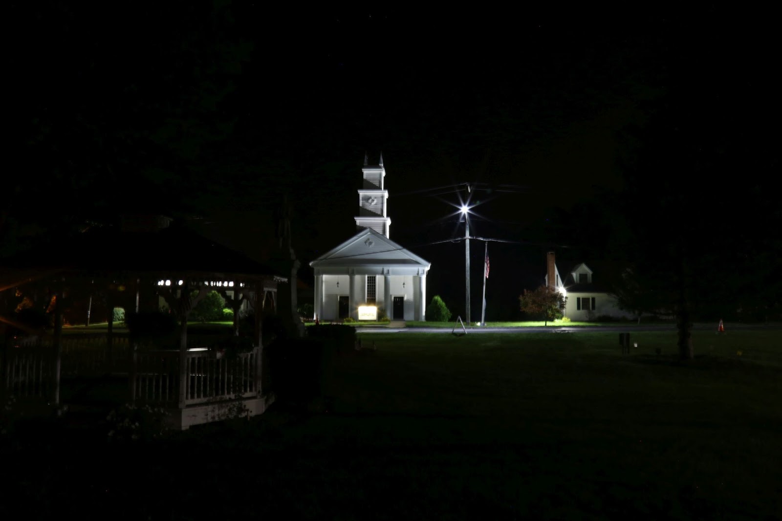
Next, a church. Looking past the under-exposure (which could probably be corrected in Lightroom) I didn't use a remote release, and pressing the shutter button jiggled the cheap tripod. If you look at the steeple, you can see some doubling. The remote release is your friend.


Finally, here's one from this last Saturday morning. Everything set up right; exposure time good. Problem is my tripod with the heavy camera and telephoto lens raised all the way to the top isn't really stable enough for the shot, and started shaking.

Remember, for every picture you see that you like, there are at least 10 that aren't good. You just don't usually get to see the bad ones. Have fun and keep shooting.
Night time presents a different set of challenges for taking pictures. DSLRs are great for flexibility and range of sensor sensitivity settings but there are still some problems. On future Fridays we'll look at some of the technical details, but for now, let's get down to the pictures. Some of these I've gone out and re-shot, some of them I haven't yet.
The first one was downtown Newtown, CT. I set the exposure far longer than I thought and moved the camera to look at it while it was still capturing. It's kind of a neat effect, but it's not well executed enough to make a it worth keeping.


Next, a church. Looking past the under-exposure (which could probably be corrected in Lightroom) I didn't use a remote release, and pressing the shutter button jiggled the cheap tripod. If you look at the steeple, you can see some doubling. The remote release is your friend.
Downtown Middletown a couple weeks ago. Long exposure, with a really strong set of diffraction spikes everywhere. The problem is that the image has some really ugly and excessive lens flare. (Look for the green splotches and things that look like water spots in various places around the image.)

Finally, here's one from this last Saturday morning. Everything set up right; exposure time good. Problem is my tripod with the heavy camera and telephoto lens raised all the way to the top isn't really stable enough for the shot, and started shaking.

Remember, for every picture you see that you like, there are at least 10 that aren't good. You just don't usually get to see the bad ones. Have fun and keep shooting.
Friday, November 10, 2017
Debugging a Managed Memory Leak with WinDbg
WinDbg is an incredibly powerful debugger for Windows, that is chronically underused. The debugger has a steep learning curve, especially for people (like me) that mostly live in the wonderful world of the debugging tools integrated into Visual Studio. Unfortunately, sometimes you need to debug a leak in a production environment, or you have a managed-native interaction that you need to debug, and you can't install Visual Studio. WinDbg to the rescue.
If you haven't already, you will need to download and install the Debugging Tools For Windows. (You only need to install the tools on one computer. You can copy windbg.exe to your flash drive or a network share. For this exploration I'll be building my project in x64, and using the x64 version of the debugging tools.)
We need a simple program to test, so here's a quick one:
Build the executable, launch it, then fire up windbg. From the file menu select "Attach To Process" and find your running executable. (It may help to change the sort to "By Executable" which orders the processes alphabetically by name.) Click "OK" to attach the debugger. You are now presented with the command window of the debugger. A quick orientation may be in order:

The main area of the window is the debugger output. This is where the results of the commands you run will be output. The textbox at the bottom of the window is where you enter commands.
The first step is to load the SOS extension for the debugger, so it knows how to look at managed code. To do this we're going to use the .loadby command. (Note the period before) loadby loads a debugger extension by looking next to a dll that's already loaded into the target process. In this case we want to load the SOS module for the running version of the .NET runtime, which is located on the computer next to clr.dll. That means that the command is
After you type the command and press enter you should see the command echoed in the debugger output. How do you know it worked? Well first there was no error. Second, you can use the .chain command to see what debugger extensions are loaded. At the top of the list, you should see SOS.
The next step is to get information about the managed heap. To do this, we will use the !DumpHeap command, and specify that we want statistical information. That command is:
Note: Debugger extension commands are always prefaced with an exclamation point ('!') and debugger commands are not case sensitive.
The data returned is in 4 columns:
Ok, but what if you want to look at more than one object. That's a lot of typing. Debugger markup language to the rescue. With the command:
As a final parting note, the SOS module has a lot more commands than the two we looked at today. There is a lot of good help built in. Just use the !help command to get a list of commands, and "!help [command]" to get more information about a specific command.
That's it for now. This was a very brief introduction that barely scratches the surface of this powerful tool. If this article was helpful, and you'd like to see more like it, feel free to leave a comment below.
If you haven't already, you will need to download and install the Debugging Tools For Windows. (You only need to install the tools on one computer. You can copy windbg.exe to your flash drive or a network share. For this exploration I'll be building my project in x64, and using the x64 version of the debugging tools.)
We need a simple program to test, so here's a quick one:
static void Main(string[] args)
{
    Test();
    Console.WriteLine("Attach the debugger. Press key after resuming");
    Console.ReadKey();
}

static List<string> guidList;
static void Test()
{
    guidList = new List<string>();
    for (int i = 0; i < 1000; i++)
    {
        guidList.Add(Guid.NewGuid().ToString());
    }
}
Build the executable, launch it, then fire up windbg. From the file menu select "Attach To Process" and find your running executable. (It may help to change the sort to "By Executable" which orders the processes alphabetically by name.) Click "OK" to attach the debugger. You are now presented with the command window of the debugger. A quick orientation may be in order:

The main area of the window is the debugger output. This is where the results of the commands you run will be output. The textbox at the bottom of the window is where you enter commands.
The first step is to load the SOS extension for the debugger, so it knows how to look at managed code. To do this we're going to use the .loadby command. (Note the period before) loadby loads a debugger extension by looking next to a dll that's already loaded into the target process. In this case we want to load the SOS module for the running version of the .NET runtime, which is located on the computer next to clr.dll. That means that the command is
.loadby sos clr(If you are trying to debug an x86 or AnyCPU build using the x64 debugger, you will get an error here. You have to use the same architecture for both the debugger and the process.)
After you type the command and press enter you should see the command echoed in the debugger output. How do you know it worked? Well first there was no error. Second, you can use the .chain command to see what debugger extensions are loaded. At the top of the list, you should see SOS.
The next step is to get information about the managed heap. To do this, we will use the !DumpHeap command, and specify that we want statistical information. That command is:
!dumpheap -stat
Note: Debugger extension commands are always prefaced with an exclamation point ('!') and debugger commands are not case sensitive.
The data returned is in 4 columns:
- MT or Method Table. This is the memory address of the information about the object's structure.
- Count. The number of objects of that type on the managed heap.
- Total Size. The total size of the objects in bytes.
- Class Name. The name of the type, like System.String. Generic types have a compiler generated name, but you should be able to figure them out.
!dumpheap -type System.StringThis command will produce a lot of output. The first section is the individual objects, with three columns: Object Memory Address, MT, and Size. The second section shows some statistics about the objects in the list. Scrolling through the first list, we can see a bunch of objects that are all 98 bytes. Let's look at one of them using the !DumpObj command.
!dumpobj [address]Replace [address] with the address from the first column. (You can omit leading zeroes.) The output will give you information about the object. Woohoo! We can see that our string is a GUID and now we know what is leaking.
Ok, but what if you want to look at more than one object. That's a lot of typing. Debugger markup language to the rescue. With the command:
.prefer_dml 1you can turn on the DML version of the commands, and you will see links in the output that you can click, that enter the appropriate command for you.
As a final parting note, the SOS module has a lot more commands than the two we looked at today. There is a lot of good help built in. Just use the !help command to get a list of commands, and "!help [command]" to get more information about a specific command.
That's it for now. This was a very brief introduction that barely scratches the surface of this powerful tool. If this article was helpful, and you'd like to see more like it, feel free to leave a comment below.
Wednesday, November 8, 2017
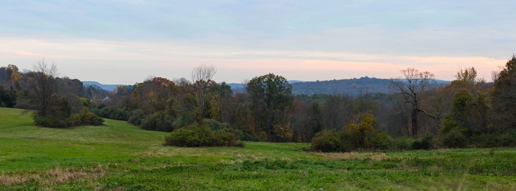
Photography Wednesday: Panorama
Hi everyone, welcome back to Photography Tuesday, now even better because it's on Wednesday. Today we're going to look at something a little different. Without further ado, here's the image:
If you noticed that the aspect ratio is a little different, you're right. This is a panorama. But, it wasn't shot with a panorama lens, and wasn't cropped from a larger image. So how did I do it? It's a relatively straight forward process.
First I took a set of images that overlap slightly. The overlap is important for stitching the image together later. Also, it's important that the source images have some distinct features on the edges where they overlap, so that the program used later can find the common points between the two to match up. For reference, here are the two images used in this panorama:
Because the nature of optics, there are two aberrations we need to correct, in order to achieve the best results. First is vignetting, which is the tendency of a lens to make an image which is darker in the corners than the center. The second is a distortion, sometimes called a pincushion distortion, which is caused by the physics of how the lens projects an image onto the sensor. If the lens were to take a picture of a perfect grid, it would end up looking more like this:
The images, corrected for the two aberrations end up looking like this:
The next step in the process was to feed the two images into an open-source program called Hugin. The program automatically finds points in the image that are the same, and stitches them together into a panorama. The raw panorama ended up looking like this:

This image was then taken into Adobe Lightroom and post processed to bring up the contrast and saturation, which made the final result shown above.
That's it for this week. If you're interested in seeing a more in-depth tutorial covering how to construct a panorama, feel free to leave a comment below or hit me up on Twitter @thebecwar.
If you noticed that the aspect ratio is a little different, you're right. This is a panorama. But, it wasn't shot with a panorama lens, and wasn't cropped from a larger image. So how did I do it? It's a relatively straight forward process.
First I took a set of images that overlap slightly. The overlap is important for stitching the image together later. Also, it's important that the source images have some distinct features on the edges where they overlap, so that the program used later can find the common points between the two to match up. For reference, here are the two images used in this panorama:

|

|
Because the nature of optics, there are two aberrations we need to correct, in order to achieve the best results. First is vignetting, which is the tendency of a lens to make an image which is darker in the corners than the center. The second is a distortion, sometimes called a pincushion distortion, which is caused by the physics of how the lens projects an image onto the sensor. If the lens were to take a picture of a perfect grid, it would end up looking more like this:
 |
| Public Domain Image From: Wikimedia Commons |

|

|
The next step in the process was to feed the two images into an open-source program called Hugin. The program automatically finds points in the image that are the same, and stitches them together into a panorama. The raw panorama ended up looking like this:

This image was then taken into Adobe Lightroom and post processed to bring up the contrast and saturation, which made the final result shown above.
That's it for this week. If you're interested in seeing a more in-depth tutorial covering how to construct a panorama, feel free to leave a comment below or hit me up on Twitter @thebecwar.
Monday, November 6, 2017
Mediocre Monday
Welcome to Mediocre Monday, a feature I'm trying out here on the blog, where we look at some attempts to photograph a subject that didn't work. Why? It's easy to get disheartened about your artistic endeavor when you produce something that doesn't live up to your expectations. This holds double if you follow any artists you admire, because you see that their final result is so utterly amazing. What you don't see is the hours upon hours of practice, and their failures to capture what they wanted. Today, and potentially on future Mondays, I will share with you my failures.
Today is a little special, since this is the first Mediocre Monday. I'm going to show you ten times I failed to get a picture of a bridge.

First attempt, in which I underexpose the image. This probably could be corrected by post-processing, but then the focus isn't quite right, and the angle is a little awkward.
 Second attempt, in which I manage to focus the camera on some random spot. Every interesting feature in the picture is out of focus. At least I managed to get a decent white balance.
 Third same as the second. Nothing in the image is in focus.
 Fourth attempt. Maybe if I move down river I can find a shot of this thing. Nope. Again the focus is... somewhere. Unfortunately that somewhere is nowhere to be found in the image.
 Fifth attempt. (Day 2) Back to the first spot. I've managed to convince myself here that I can somehow keep the 400mm lens steady enough to shoot at 1/6th of a second. I couldn't. (No one can. Get a tripod.)
 Sixth attempt. Still trying and failing to keep a heavy lens balanced enough to hit 1/6th of a second. It's better than the fifth attempt, but it's still janky enough to make you dizzy.
 Seventh Attempt. (Third Day) The slightly less completely insane 1/10th of a second. This time I convinced myself that my monopod was steady enough to get that slow exposure. (It wasn't)

Eighth attempt. Basically the same shot as number seven, but this time adding in a complete lack of focus. (Again 1/10th of a second.)
 Ninth attempt. This time I've bumped up the ISO speed from 200 to 800 so I'm now shooting at the entirely reasonable 1/60th. We're a little underexposed, but I could live with it. If only I could have focused correctly. I think this time I focused, switched off auto focus to adjust the angle, and didn't correctly confirm focus before the shot.
 Tenth attempt. This time I've managed to capture a mostly in-focus image. It's a little under-exposed, but fixable. It's also not as crisply focused as I wanted, but it's ok. I still probably wouldn't put this in my portfolio.
Ten attempts. Ten failures. Will number eleven be the one that does it? Will it take another hundred attempts? Who knows. Next time you're discouraged that someone seems to be able to produce 'good' results every time, remember that you're only seeing the stuff that's good enough to share.
(If you're an artist, and would like to guest post on a Mediocre Monday to share your failures, get in touch, I'd love to have you.)
Today is a little special, since this is the first Mediocre Monday. I'm going to show you ten times I failed to get a picture of a bridge.

First attempt, in which I underexpose the image. This probably could be corrected by post-processing, but then the focus isn't quite right, and the angle is a little awkward.


Eighth attempt. Basically the same shot as number seven, but this time adding in a complete lack of focus. (Again 1/10th of a second.)


Ten attempts. Ten failures. Will number eleven be the one that does it? Will it take another hundred attempts? Who knows. Next time you're discouraged that someone seems to be able to produce 'good' results every time, remember that you're only seeing the stuff that's good enough to share.
(If you're an artist, and would like to guest post on a Mediocre Monday to share your failures, get in touch, I'd love to have you.)
Friday, November 3, 2017
Averages Lie
Averages lie. Also called the arithmetic mean by pretentious math types1, the average is what you get when you add a bunch of values together, then divide by the total number of items.
Yep those averages. They lie.
Let's look at a concrete example. A dutch hip-hop artist and wannabe entrepreneur, let's call him Double-V, has an idea for a product. For something to use for the discussion, let's say that his product is a diet scam called Raps, by Vit Voorks.2 He decides that he wants to structure his sales as a multi-level marketing scheme3. Let's say he has 11 sales reps and says in his recruiting information:
Intuitively, for most people, when you hear that the average commission total was $500, you assume that if you pick a person, at random, from the collection of sales people, that their commission should be somewhere around $500. This is not true. The distribution of commissions could look like this:
The average tells you nothing about the distribution of those values. Like I said, averages lie.
What if we have this data, and we want to be honest about it? We want to tell people how the salaries are distributed, not just the average. To do that we'll use something called the standard deviation. (For the rest of this, I'm going to switch to the more correct term mean instead of average.)
The standard deviation is a measurement of how far from the mean value the people are. Let's look at the standard deviations4 of our three examples:
In best case the standard deviation is 0, which means that there is no variation in the salaries. In the worst, it sits at $1513.82, which means that the salaries are spread more widely. Thanks to some statistical rules5, we can say with reasonable confidence that about 80-90% of people make a salary within 3 standard deviations of the average. Let's look at the numbers:
A quick sidebar about the two other things you probably learned in elementary school, then quickly forgot: median and mode.
Median is the center value. If you arrange the salaries in order from largest to smallest, then pick the one in the middle of the list, that's the median. Medians are better suited for data which is mostly clustered around one value, with a few values much higher or much lower.6
Mode is the most common value. If you put people into groups based on how much money they made from this scheme, the salary of the people in the largest group would be the mode. (That angry group of 10 people who made $0. Sorry imaginary people.)
This post is starting to get long,7 so we'll leave the topic here for now. Hopefully this overview gave you some information that will help you think critically about averages. If this was useful to you, please share it. If you are a mathsy person and have a correction, feel free to leave a comment below, or send me a message on twitter @thebecwar.
1 Myself included.
2 No, this wasn't chosen to be similar to some product.†
3 Also known colloquially as a pyramid scheme.
4 For those who have been exposed to this before, I'm using the population standard deviation, because we have the entire population.
5 There's a lot of handwaving here, since there's no guarantee that the salaries fit into any of the distributions that Mr. Chebyshev's inequality covers. Sorry math nerds.
6 This is why it's often used when talking about home prices in a city. The median completely ignores the really expensive houses, and the really cheap houses.
7 He says after writing too many words already.
† Yes it was
Yep those averages. They lie.
Let's look at a concrete example. A dutch hip-hop artist and wannabe entrepreneur, let's call him Double-V, has an idea for a product. For something to use for the discussion, let's say that his product is a diet scam called Raps, by Vit Voorks.2 He decides that he wants to structure his sales as a multi-level marketing scheme3. Let's say he has 11 sales reps and says in his recruiting information:
The average salesperson made $500 in commissions.That sounds like a pretty good deal. But is it?
Intuitively, for most people, when you hear that the average commission total was $500, you assume that if you pick a person, at random, from the collection of sales people, that their commission should be somewhere around $500. This is not true. The distribution of commissions could look like this:
500, 500, 500, 500, 500, 500, 500, 500, 500, 500, 500Which, if you add together and divide by 11, like they taught you in grade school, gives you the average salary $500. This is the view that Vit Voorks wants you to take. He wants you to think everyone makes a bunch of money. In reality, the commissions could also look like this:
4000, 400, 200, 200, 100, 100, 100, 100, 100, 100, 100Or even worse:
5500, 0, 0, 0, 0, 0, 0, 0, 0, 0, 0Where one person makes $5500, and the rest make nothing. If you do the math again, you'll note that the average in all three cases is $500, but in the last case, the majority of people made absolutely nothing.
The average tells you nothing about the distribution of those values. Like I said, averages lie.
What if we have this data, and we want to be honest about it? We want to tell people how the salaries are distributed, not just the average. To do that we'll use something called the standard deviation. (For the rest of this, I'm going to switch to the more correct term mean instead of average.)
The standard deviation is a measurement of how far from the mean value the people are. Let's look at the standard deviations4 of our three examples:
- Salaries: 500, 500, 500, 500, 500, 500, 500, 500, 500, 500, 500
Standard Deviation: 0 - Salaries: 4000, 400, 200, 200, 100, 100, 100, 100, 100, 100, 100
Standard Deviation: 1063.01 - Salaries: 5500, 0, 0, 0, 0, 0, 0, 0, 0, 0, 0
Standard Deviation: 1513.82
In best case the standard deviation is 0, which means that there is no variation in the salaries. In the worst, it sits at $1513.82, which means that the salaries are spread more widely. Thanks to some statistical rules5, we can say with reasonable confidence that about 80-90% of people make a salary within 3 standard deviations of the average. Let's look at the numbers:
- Skipping this one, everyone makes the same amount of money.
- Mean: 500
Standard Deviation: 1063.01
3 Standard Deviations: 3189.04
80-90% of people should make: 3689.04 to -2689.04 - Mean: 500
Standard Deviation: 1513.82
3 Standard Deviations: 4541.47
80-90% of people should make: 5041.47 to -4041.47
A quick sidebar about the two other things you probably learned in elementary school, then quickly forgot: median and mode.
Median is the center value. If you arrange the salaries in order from largest to smallest, then pick the one in the middle of the list, that's the median. Medians are better suited for data which is mostly clustered around one value, with a few values much higher or much lower.6
Mode is the most common value. If you put people into groups based on how much money they made from this scheme, the salary of the people in the largest group would be the mode. (That angry group of 10 people who made $0. Sorry imaginary people.)
This post is starting to get long,7 so we'll leave the topic here for now. Hopefully this overview gave you some information that will help you think critically about averages. If this was useful to you, please share it. If you are a mathsy person and have a correction, feel free to leave a comment below, or send me a message on twitter @thebecwar.
1 Myself included.
2 No, this wasn't chosen to be similar to some product.†
3 Also known colloquially as a pyramid scheme.
4 For those who have been exposed to this before, I'm using the population standard deviation, because we have the entire population.
5 There's a lot of handwaving here, since there's no guarantee that the salaries fit into any of the distributions that Mr. Chebyshev's inequality covers. Sorry math nerds.
6 This is why it's often used when talking about home prices in a city. The median completely ignores the really expensive houses, and the really cheap houses.
7 He says after writing too many words already.
† Yes it was
Subscribe to:
Posts (Atom)
-
A common question presented in interviews for developer positions goes something like this: Given an array of numbers, write a function th...
-
 Day 28: Bright A bit more experimental today. Edited to make it more ethereal and to soften the edges. And with that Phebruary is ov...
